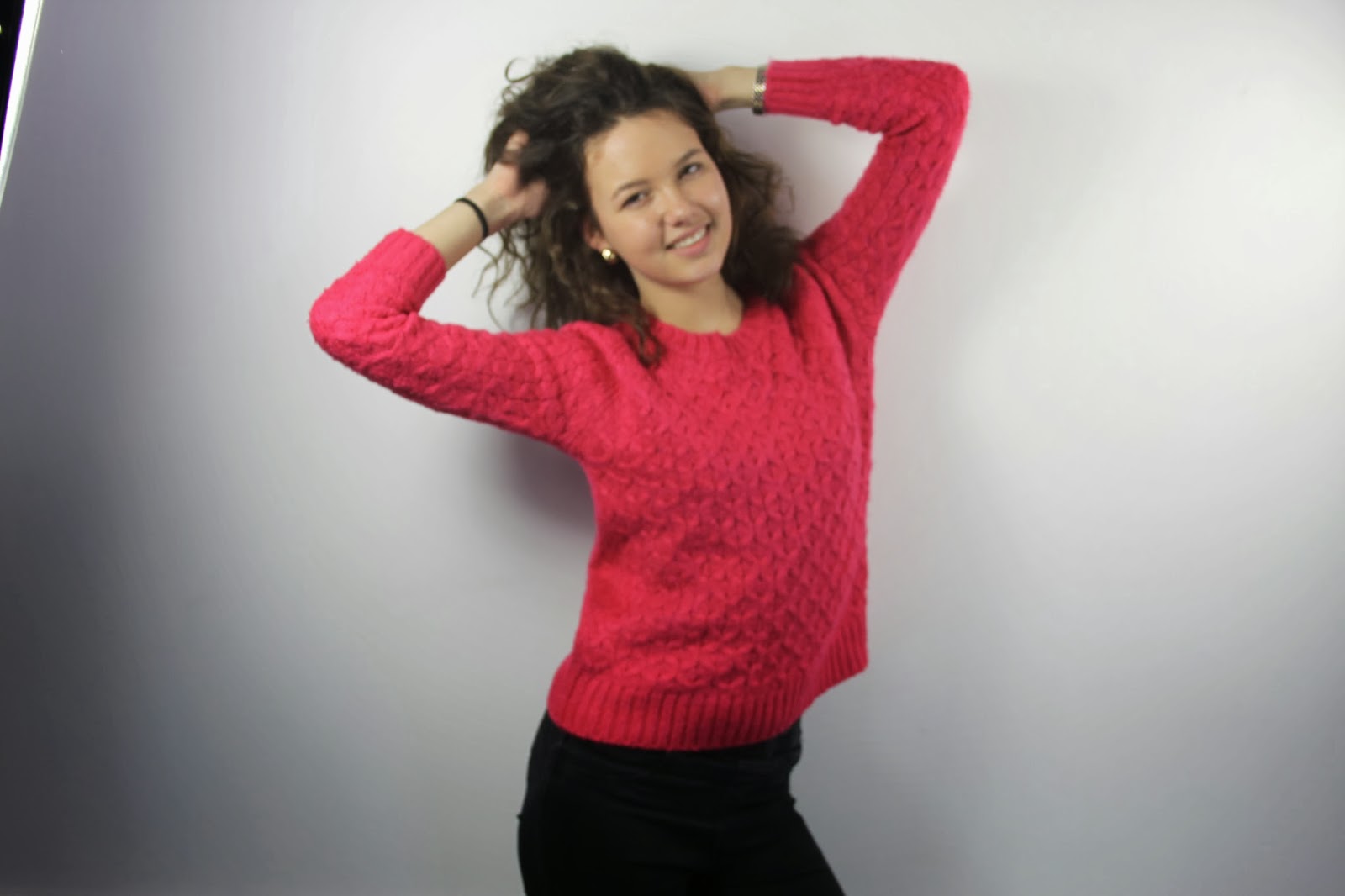
After waiting for the Editing suite to be free I finally
had the chance to take pictures for
my front cover after school, everything had seemed like it was going well until
I had downloaded the images onto my computer. The images came out blurry and I
couldn’t use them for the front cover as it wouldn’t look professional, neither
could I have fixed it on Photoshop as it would have
taken forever to figure it out. I didn’t have time to take them again as it was
getting late. So I didn't really learn my lesson from the test shots.
Few days later I had the chance to take them again, I
made sure the camera was focused throughout the shoot so I wouldn't have to go
through the trouble of taking them again as time was running out. There were
few images I liked, they came out really well. I have chosen the three final
images I shall be using for my cover.
I was planning on using the one with the pink jumper but
had realised it may clash with the font colour scheme as it had included the
colour pink which I didn't think thoroughly about beforehand. Whereas the other image were more of a casual clothing which were
also appropriate for a Pop magazine and it may attract fashion lovers as the model's outfit is currently the 'new look'. I looked at more magazine covers to see
what clothing they wore, most of them wore casual instead of looking glamorous.
I’ve decided to use the second image as her face is
clearly shown to the audience with a big grin on her face, it follows the
conventions of a Pop image. The last image seems to be slightly darker and her grin is not as big as the second image also her eyes aren't widely opened unlike the second image. The second image shadow is visible so I will have to use Photoshop to hide the shadow so the background can be clear and it will look more professional.
I had decided to put pink lipstick on her so it could
match the theme colour. Her clothing was not how I wanted it to be, I preferred
a dress but casual clothing is still good. The lighting is bright so we can see
her facial expression clearly, it feels warm and welcoming to the audience rather than having the image dark, this would contradict the conventions of a Pop magazine. I
didn’t use any props as I wanted my model to play with her hair, to show off her girly side and to make the magazine seem fun.


No comments:
Post a Comment