Sunday, 16 February 2014

Front cover: Features

I was first planning on using these features for my cover, I thought the colours blended in well and the layout was very clear. The only problem I had was not being able to see the text clearly because of the 
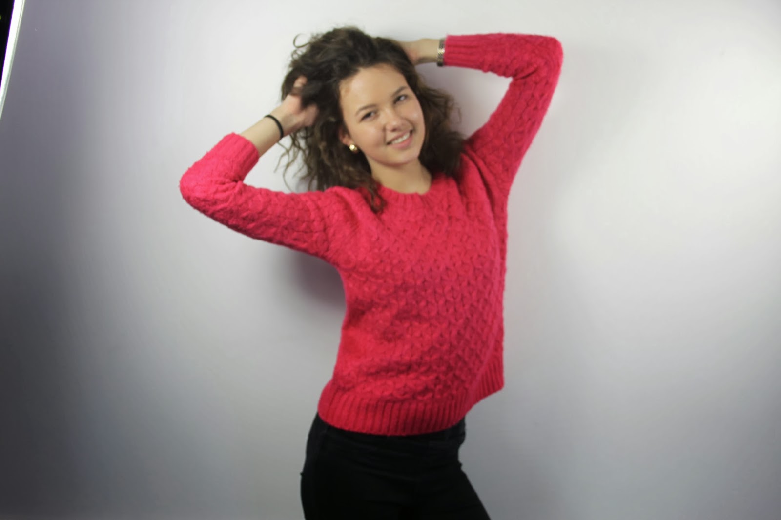
image clashing with the writing making it hard to read. I used pink as it matched her lipstick, after playing around with the colour scheme I came up with pink, blue and purple. I was not aware of the amount of colours I was supposed to use, if I knew then I probably would have then just used pink and blue. The graphic was one of my favourite part because I thought it would make my magazine look professional since it was very simple but the font colour should have been white so it could stand out. Looking at it now, the writing doesn’t stand out as much, it would have been very hard to read and it was quite dull compared to how the features look now.

The features now look much better, they stand out more and there is more colour to the magazine. The text stands out more with the highlight making it easier to read and it looks more attractive to the eye. The pull quote has been changed to white so it could be easier to read and it stands out from the other features because it’s not highlighted or coloured. The graphic to introduce the interview has been changed to a rectangle at first I wasn’t happy about it but now it looks better above the name of the artist. The artist name font colour had been changed to match the theme colour, the theme colour had been changed to pink, purple, black and white. Changing the colours made a huge difference as the magazine looks more like a Pop magazine and it functions well together.
The gossip girls was a great touch to fill up the empty spaces of the magazine, it stands out because the boxes are different sizes and slightly tilted rather than being straight like the other features. I also included another graphic of a splash, this just fills up the corner and it also looks great and conventional especially with the ‘OMG!’ on the side to make it seem girly.
Overall, I believe the changes to the features look much better and they obviously play a huge part in making my magazine.

Front cover: Inspiration

I was beginning to lose ideas to add onto my magazine so I went onto Google and searched for Pop magazines and had a look at what other features they used on their magazine. I came across a magazine where they used this idea of introducing ‘Gossip girls’, I tried to use this idea for my magazine. If I didn’t like it I could always get rid of it and find something else. At first I thought it would be too much pink and purple so I had to ask a friend what she had thought and she said it’s conventional and meets the criteria of having a Pop magazine, it’s supposed to be cheesy. 


Front cover: More changes

As you can see I have made changes to my magazine, the masthead has been changed to a bolder font, this is my last change to the masthead. It stands out and fits well with the magazine, I also changed the colour because purple was too dark and it didn’t feel like a Pop magazine unless it was pink. For the other text I decided to make them black and white and added pink and purple box behind them to stand out. I did this because it didn’t stand out as much on it’s own, it kept clashing with the image and making it hard to read. So I had a look at few other magazines and had noticed they would highlight most of their text to stand out. 


Now it’s beginning to feel like a Pop magazine but it still feels very empty and in order for it to look like a Pop magazine it needs to be cramped. Also the pull quote is still in black and the colour will need to be changed for it to stand out. 


I added another graphic onto the magazine to take up the left hand corner as it was quite empty, I used a splash as it seemed appropriate for this genre. I used the splash to introduce a competition to meet One Direction, I also added ‘OMG!’ on the side to make it seem like it’s a big reward for an audience to win.

I was playing around with the adjustments of the image until I came across photo filter, this colour gave a good touch to the image. The background now has a touch of light pink, this gives the image more of a girly feel to the Pop magazine which works very well rather than just having it plain white. 


Saturday, 15 February 2014

Front cover: Changes

During our lesson Miss Mottram had a look at my magazine and made major changes to them. At first I wasn’t quite happy about this idea since I liked the way my cover was already but I knew it was for the best. I had to get rid of the blue in my colour scheme as I’m only allowed to use two colours with black and white, so my colour scheme has been changed to pink, purple, black and white. Miss Mottram had moved the name of the artist into the middle of the sheet, so it stands out more. I also changed the colour from blue to pink to match her lips. She removed the circle graphic to a rectangle which I filled it with purple paint. Miss Mottram did say the placement of the name and graphic is mainly the most important part of the magazine then I can just add on the other text later on. She had also enlarged the masthead as it was too small and not bold enough. As you can see below the pull quote is overlapping the other text which I will need to fix. 


From this I can see that it still doesn’t feel like a Pop magazine, also the masthead doesn’t seem to stand out as much anymore. So I will need to find another font that will fit with Pop genre. I might also change the colour as it seems too dark for a Pop magazine and it needs to be bright in able for it to be effective. Also the pull quote is hard to read so I will have to change the colour to preferably white. It seems very empty compared to a Pop magazine, the magazines are usually packed with text, graphic and images. I won’t be adding any pictures onto the cover as I won’t have time to take anymore so I will need to use more graphics and writing to take up the space without it looking unattractive. I could also try to change the colour of the background as it seems quite dull and doesn’t look like a Pop image. The text are too close to the edge so I will have to bring them in slightly including the masthead. There are quite a lot of things I need to work on to bring my cover together. 

Front cover: Layout on Photoshop

I changed the name from ‘Josie Blue’ to ‘Lacey Dixon’ as it seemed more realistic and it’s still short and easy to remember. I changed my colour scheme to pink, blue and purple, I thought these colour would blend in very well together. I’ve also used a graphic to introduce Lacey’s first interview ever, hoping it would be eye catching so it would be the first text the audience would read. I used the font from ‘dafont’ rather than Photoshop as there was more of a variety to choose from.


I included a barcode and price which I had forgotten to add on my flat plan, it makes my magazine seem realistic. I added more text including another pull quote and at this point it was starting to look like a magazine but I knew it didn’t look like a proper Pop magazine cover. So I had asked a few of my peers on what they had thought about it. They all said they had liked it and it seemed like an actual Pop magazine. This did boost up my confidence and I preferred this layout to my flat plan as it seemed to fit in well together. 


Front cover: Photograph manipulation


I inserted my image onto Photoshop, as I have said in the last post, I will need to remove the shadow. I had no idea how to get rid of it quickly so I decided to cheat and use a rubber to clear away the shadow. 

I zoomed into the shadow and chose the right rubber size to clear away the shadow, I had to be very cautious making sure I didn’t accidently rub anything else other than the shadow. I had to rub out some of her hair on the right side of her shoulder as it looked weird as it was just hanging there, it didn’t look right. This took me five minutes to complete. I also slightly re-sized the image so it could be place perfectly onto my cover. 


As you can see the shadow has gone and you can’t even tell there was one in the first place. Now the image seems much more better and neither does it seem unprofessional. Before I had added the image onto Photoshop it had looked really bad compared to the others but after clearing up this one little problem now it seems to be much better and the quality suddenly seems to be better. 

I also added vibrance to my image, this made the colour of her lipstick pop out more. Now the image seems to be much clearer and it stands out. From my research I had found out most people find the image to be the most effective feature they look out for. If I used my blurry image from before then it wouldn’t bring people in and may put people off from reading the magazine any further. 


Front cover: Shots taken

After waiting for the Editing suite to be free I finally had the chance to take pictures for my front cover after school, everything had seemed like it was going well until I had downloaded the images onto my computer. The images came out blurry and I couldn’t use them for the front cover as it wouldn’t look professional, neither could I have fixed it on Photoshop as it would have taken forever to figure it out. I didn’t have time to take them again as it was getting late. So I didn't really learn my lesson from the test shots. 


Few days later I had the chance to take them again, I made sure the camera was focused throughout the shoot so I wouldn't have to go through the trouble of taking them again as time was running out. There were few images I liked, they came out really well. I have chosen the three final images I shall be using for my cover.


I was planning on using the one with the pink jumper but had realised it may clash with the font colour scheme as it had included the colour pink which I didn't think thoroughly about beforehand. Whereas the other image were more of a casual clothing which were also appropriate for a Pop magazine and it may attract fashion lovers as the model's outfit is currently the 'new look'. I looked at more magazine covers to see what clothing they wore, most of them wore casual instead of looking glamorous. 


I’ve decided to use the second image as her face is clearly shown to the audience with a big grin on her face, it follows the conventions of a Pop image. The last image seems to be slightly darker and her grin is not as big as the second image also her eyes aren't widely opened unlike the second image. The second image shadow is visible so I will have to use Photoshop to hide the shadow so the background can be clear and it will look more professional. 

I had decided to put pink lipstick on her so it could match the theme colour. Her clothing was not how I wanted it to be, I preferred a dress but casual clothing is still good. The lighting is bright so we can see her facial expression clearly, it feels warm and welcoming to the audience rather than having the image dark, this would contradict the conventions of a Pop magazine.  I didn’t use any props as I wanted my model to play with her hair, to show off her girly side and to make the magazine seem fun.